Modal exercise
Now we're ready to create our first composite component! Create a new file Modal.js inside of the components/ folder.
Additionally, create an index.js file and let's export all components from Buttons.js and Modals.js.
export * from "./Buttons";
export * from "./Modals";
Now we will be able to import components from /components instead of /components/Buttons or /components/Modals. You can update index.js accordingly.
Adding An Illustration
First let's add our illustration. Export the illustration from Figma as an SVG.
Inside of src/ create an assets/ folder and inside add an illustrations/ folder.
Save your SVG in a file called SignUp.svg and add it to the illustrations folder.
Let's also create an index.js file inside of the assets folder and export our newly added illustration.
export const Illustrations = {
  SignUp
};
Let's also add a new variable to our themes formElementBackground.
For light theme we'll use neutral[100] and for dark theme we'll use blue[100]. blue[100] isn't necessarily the best background color for the dark-theme modal, but I just want to illustrate the state change. You're welcome to use whichever values you like.
We'll also need a textOnFormElementBackground variable which will be neutral[600] for the default theme and neutral[100] for the dark theme.
// Default theme
formElementBackground: neutral[100],
textOnFormElementBackground: neutral[600],

// Dark theme
formElementBackground: blue[100],
textOnFormElementBackground: neutral[100],
Inside of Modals.js let's import React as well as styled-components.
import React from "react";
import styled from "styled-components";
First let's create our modal wrapper which will contain all of the styling for our modal.
const ModalWrapper = styled.div`
  width: 800px;
  height: 500px;
  box-shadow: 0 5px 16px rgba(0, 0, 0, 0.2);
  background-color: ${props => props.theme.formElementBackground};
  color: ${props => props.theme.textOnFormElementBackground};
  display: flex;
  flex-direction: column;
  justify-content: center;
  align-items: center;
  position: relative;
  border-radius: 2px;
  background: ${props => props.theme.formElementBackground};
`;
Next, let's create the sign up header and sign up content as styled components. They will both use our type scale.
First import the typeScale variable then add it to the following declarations.
import { typeScale } from "../utils";const SignUpHeader = styled.h3`
font-size: ${typeScale.header3};
`;
const SignUpText = styled.p`
font-size: ${typeScale.paragraph};
max-width: 70%;
text-align: center;
`;Now let's create a SignUpModal which inherits from ModalWrapper. This will allow us to be very explicit with our component imports <SignUpModal />.
You can of course create a basic Modal element and add children inside, which is great to encapsulate logic closer to where it's being used, but for the sake of this tutorial let's create the sign up modal inside of the Modals file.
Don't forget to import PrimaryButton so we can use it in our modal. You can use the default or the named export. We'll also need our SignUp.svg illustration.
import { PrimaryButton } from "./Buttons";
import { Illustrations } from "../assets";
export const SignUpModal = () => {
return (
<ModalWrapper>
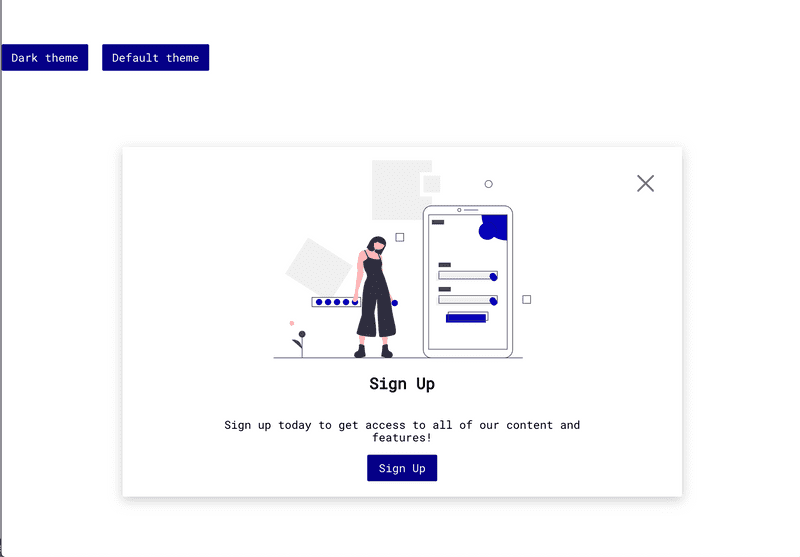
<img src={Illustrations.SignUp} alt="Sign up for an account!" />
<SignUpHeader>Sign Up</SignUpHeader>
<SignUpText>
Sign up today to get access to all of our content and features!
</SignUpText>
<PrimaryButton onClick={() => console.log("You signed up!")}>
Sign Up
</PrimaryButton>
</ModalWrapper>
);
};Now let's add our close icon. We can export it as an SVG from Figma and create a new file CloseIcon.js inside of our assets folder. Create a new folder icons/ inside of assets/ and place CloseIcon.js inside.
Let's make CloseIconWrapper a styled component so we can set some styling on it.
import React from "react";
import styled from "styled-components";

const CloseIconWrapper = styled.svg`
  width: 100%;
  height: 100%;
`;

export const CloseIcon = () => (
  <CloseIconWrapper aria-hidden="true">...</CloseIconWrapper>
);
You should only use inline-SVG for elements whose properties will be changing in response to user interaction (i.e. hover, focus). For static SVG elements, like our illustration, you should use <img src={...} /> to reduce file bloat.
Now let's export CloseIcon from the assets index.js.
export * from "./icons/CloseIcon";We can import CloseIcon and our illustrations into Modals.js and use it in our SignUpModal component.
import { Illustrations, CloseIcon } from "../assets";Now let's create a button which will wrap the CloseIcon. Then we'll instantiate the icon inside of the button.
import { SignUp, CloseIcon } from "../assets";

...
const CloseModalButton = styled.button`
  cursor: pointer;
  background: none;
  border: none;
  position: absolute;
  top: 40px;
  right: 40px;
  width: 24px;
  height: 24px;
  padding: 0;
`;

export const SignUpModal = () => {
  return (
  <ModalWrapper>
    ...
    <CloseModalButton aria-label="Close modal" onClick={() => console.log("You closed the modal!")}>
      <CloseIcon />
    </CloseModalButton>
  </ModalWrapper>
  );
};
If we head back to index.js we can import SignUpModal and instantiate it.
import { SignUpModal } from "./components";

...

<SignUpModal />
Now build your second Figma modal which you designed in the last chapter.
For the text fields, you can grab the code in the course GitHub repository.
