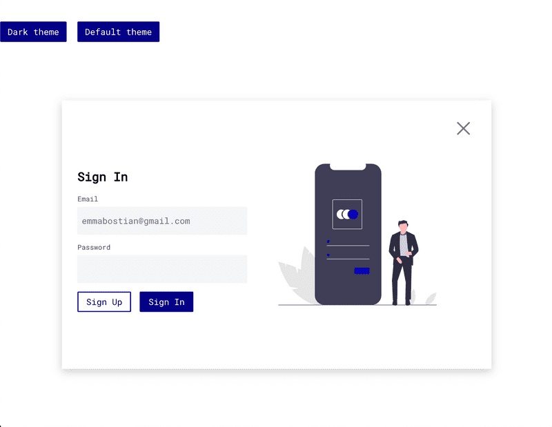
Modal exercise solution
I first downloaded my Sign In illustration as an SVG and added to the assets/illustrations folder. Because it's a simple SVG file we don't have to add it to the exports in index.js.
Next inside Modals.js I imported both text fields, secondary button and the sign in illustration.
import { CloseIcon } from "../assets";
import { PrimaryButton, SecondaryButton } from "./Buttons";
import { EmailInput, PasswordInput } from "./TextFields";
I refactored SignUpHeader to be ModalHeader so it's more extensible, and updated the respective JSX tags.
const ModalHeader = styled.h3`
  font-size: ${typeScale.header3};
`;

...

<ModalHeader>Sign Up</ModalHeader>
Next I created the SignInModal component. I need a two-column layout so I created a new ModalWrapper.
const ColumnModalWrapper = styled(ModalWrapper)`
  flex-direction: row;
  justify-content: space-around;
`;
export const SignInModal = () => (
<ColumnModalWrapper>
<div>
<ModalHeader>Sign In</ModalHeader>
<EmailInput label="Email" placeholder="emmabostian@gmail.com" />
<PasswordInput label="Password" />
<SecondaryButton style={{ margin: "16px 16px 0 0" }}>
Sign Up
</SecondaryButton>
<PrimaryButton>Sign In</PrimaryButton>
</div>
<img src={SignIn} alt="Sign in to your account" />
<CloseModalButton onClick={() => console.log("You closed the modal!")}>
<CloseIcon />
</CloseModalButton>
</ColumnModalWrapper>
);You can import this to index.js and test it out!
If you're lost or missed some code, you can check out the branch step-1-styled-components on the GitHub repo!
