Using themes
At the moment, Storybook is unaware of our theme, so our components aren't rendering with the correct styling.
To pass the theme prop to our components we have to do a bit of configuration.
First install two add-ons: background and contexts.
npm i -D @storybook/addon-backgrounds @storybook/addon-contextsNext, add the two add-ons to the addons array in main.js.
module.exports = {
  stories: ["../src/**/*.stories.(js|mdx)"],
  addons: [
    "@storybook/preset-create-react-app",
    "@storybook/addon-docs",
    "@storybook/addon-contexts/register",
    "@storybook/addon-backgrounds/register"
  ]
};
Now let's create a new file, contexts.js inside of the .storybook directory and add the following.
import { ThemeProvider } from "styled-components";
import { defaultTheme, darkTheme } from "../src/utils";

export const contexts = [
  {
    icon: "box", // a icon displayed in the Storybook toolbar to control contextual props
    title: "Themes", // an unique name of a contextual environment
    components: [ThemeProvider],
    params: [
      // an array of params contains a set of predefined `props` for `components`
      { name: "Default Theme", props: { theme: defaultTheme, default: true } },
      { name: "Dark Theme", props: { theme: darkTheme } }
    ],
    options: {
      deep: true, // pass the `props` deeply into all wrapping components
      disable: false, // disable this contextual environment completely
      cancelable: false // allow this contextual environment to be opt-out optionally in toolbar
    }
  }
];
Now that we have our context, our themes, we have to tell Storybook about it. Create a new file inside of the .storybook directory called preview.js.
import { addParameters } from "@storybook/react";
import { addDecorator } from "@storybook/react";
import { withContexts } from "@storybook/addon-contexts/react";
import { contexts } from "./contexts";

addParameters({
  backgrounds: [
    { name: "Default theme", value: "#ffffff", default: true },
    { name: "Dark theme", value: "#050449" }
  ]
});

addDecorator(withContexts(contexts));
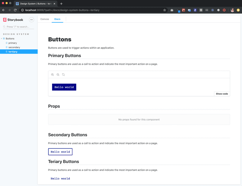
Now if we restart our Storybook server, we should see our buttons rendering in the UI. We also have a Docs tab which houses all of our documentation.
