Integrating styled components
Before we run our React application, let's remove some of the boilerplate.
Remove everything inside of the src/ folder.
Now let's add a new file inside of the src/ folder called index.js.
(You can also manually delete all of these files if you don't feel like re-adding them, however I think it's good to walk through the process and saves me a bit more time as opposed to manually deleting each individual file).
Let's just add a simple App component which returns a div containing the words "Hello World".
import React from "react";
import ReactDOM from "react-dom";

const App = () => <div>Hello world</div>;

ReactDOM.render(<App />, document.querySelector("#root"));
When we run npm start to start our development server we should see the words "Hello World" appear in the browser.
Let's go ahead and add styled components to see them in action.
In your terminal run npm install styled-components. You can also type npm i styled-components as a shorthand.
Once installed, create a new folder called components inside the src/ directory and add a file called Buttons.js.
You can add a new folder and file at the same time in VSCode by clicking 'Add new file' and typing components/Buttons.js in the name field. Cool right?!
Inside the Buttons.js file let's import styled from styled-components and add our first styled component.
import styled from "styled-components";

const PrimaryButton = styled.button`
  background-color: red;
  border: none;
  color: white;
  padding: 12px 24px;
  font-size: 1rem;
`;

export default PrimaryButton;
Back inside of index.js, import PrimaryButton from ./components/Button and render it inside of the wrapping div.
import React from "react";
import ReactDOM from "react-dom";
import PrimaryButton from "./components/Buttons";

const App = () => <PrimaryButton>Hello world</PrimaryButton>;

ReactDOM.render(<App />, document.querySelector("#root"));
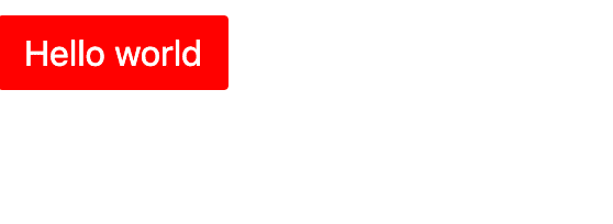
In your browser you should see a red button with the white text "Hello World".
We can do some pretty amazing things with styled components.
