Button styles
There are many styles you can use to convey your button hierarchy. Your buttons should look and function like a button. Here are some common button patterns which are familiar to most users.
Solid Buttons
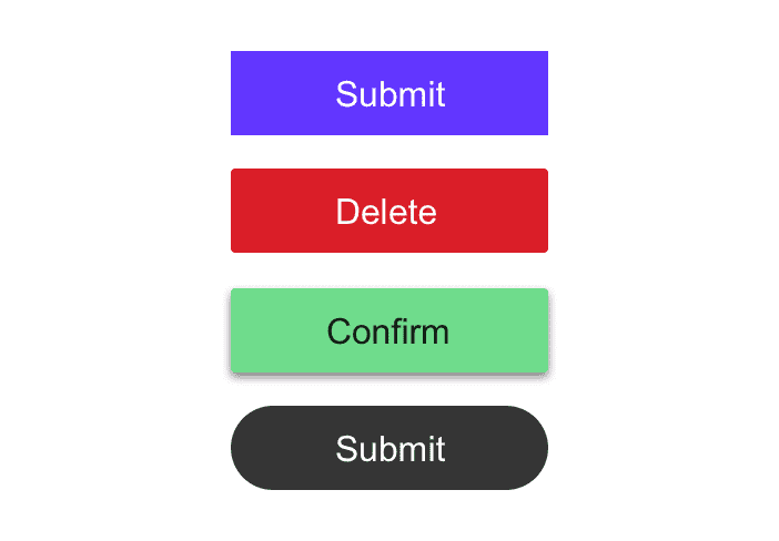
Solid buttons are buttons with a solid background fill. They're easily recognizable and a great choice for a primary button.
Line / Ghost Buttons
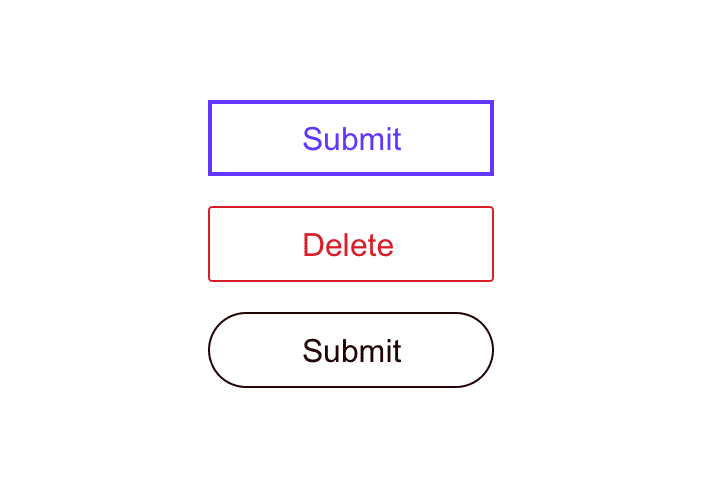
Ghost buttons are buttons without a background fill; they only have an outline.
Icon Buttons
Icon buttons have no label and are only an icon. Keep in mind that buttons and icons without a label are bad for accessibility and if a label can be used it should.
However, if you do choose to forgo the label, be sure to include an aria-label attribute on the button explaining the action that will be completed when triggered and not an explanation of what the icon is.
Button Styles
Border Radius
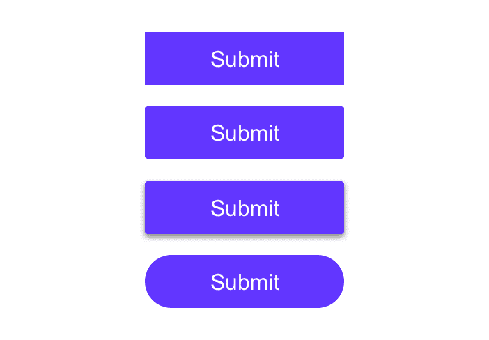
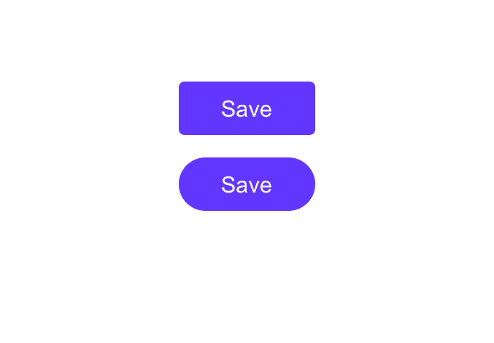
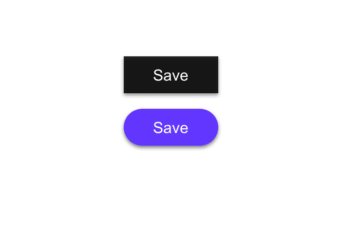
You may choose to have a button with 90 degree squared edges, a partial border-radius, or a full border-radius and it will impact your brand identity.
Rounded buttons are more playful than buttons with squared edges. Your button design should coincide with your brand identity.
Drop Shadow
You may also choose to add a drop shadow to your button which will elevate it off the page. You can add a drop shadow, or box shadow, to a button on hover or focus as well.
Label Style
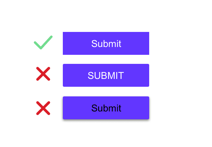
When choosing your label style, be sure you place readability above all else. While uppercase-text buttons look modern, they are often harder for users to read, so you should choose sentence-case over uppercase.
You also need to ensure that you have sufficient color contrast between the label and the button.
Lastly, use a font-weight which is legible.
Vertical Padding
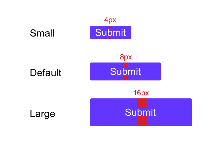
You must ensure your buttons are large enough to be accessible and clickable on a mobile device. Instead of stating a hard-coded height for your button, add vertical padding. This will allow the browser to change the text size (for visually impaired users) without cutting off the text.
Vertical padding of 16px is a great option for a large button, 8px for a default button, and 4px for a small button.
Horizontal Padding
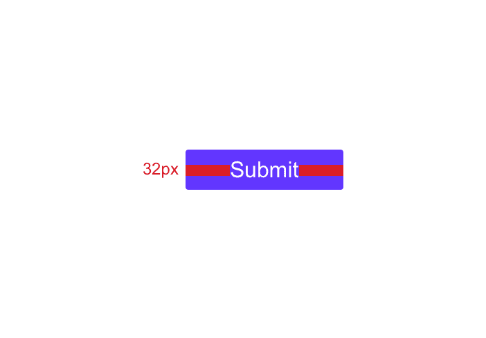
To keep your buttons responsive, you can add horizontal padding. You can additionally add a min-width property so you don't get tiny buttons.
For example, 32px of padding on the left and right side of the button with a min-width of 100px is a great option.
